Hi ladies. I am back today with another fun layout I created using the September Sundance kit. The patterns and die cuts in this month’s kit is so pretty. I love them. I’ve had these photos for a few months now, but didn’t have the right papers and embellishments to go with them. I pulled the blue and cream colors from the photos to create a well balanced layout.
I wasn’t sure at first if the washi would go with this layout, but I managed making it work by adding the tiny red plaid star sticker to help pull the red into the layout. I used a pen and ruler to create faux stitching on the heart sticker.
I layered several die cuts together at the bottom of the photo to help pull the photos together. And to balance it out, I added a few more at the top right photo in the corner. Then I added my hand-journaling to complete the layout.
Hello, Clique friends. Today I’m bringing a new layout created with the gorgeous September Sundance kit.
My goal for this page was to include multiple pictures. Although I tend to make one-photo layouts, sometimes I feel like that is not enough to document a story or capture the little details. Here you can see my oldest daughter playing the ukulele. I love how focused and passionate she gets every time she plays. Nothing can distract her! Those three pictures needed to go together on one page 🙂 I reduced their size to measure about six inches in length all together. It was like working with one 4×6” photo.
I started by fussy cutting several flowers from one of the 1Canoe2 patterned papers that came in the kit. I was planning on having a white background and wanted to include pops of color and dimension by adding those cut outs here and there. To bring in more interest, I decided to use a cut file from my stash to cover a little more than half of the page. I love the tone-on-tone look. It is subtle but definitely noticeable.
I adhered the three pictures together on layers of card stock and popped them up with some foam. The leaves and additional flowers you see on the right-hand side were fussy cut from another paper in the kit. I like how the pink brings in an extra element of color. It also created the perfect spot for the acrylic words and heart. Enamel dots finished the layout.
I hope this has inspired you to get creative with your kit and include multiple photos on your pages. This kit is absolutely lovely and very versatile. Get yours before it’s gone!
Hello! Here Réka is today with you, and I have a layout with multiple pictures to share, featuring the gorgeous ’Sundance’ Traveler’s Notebook Kit.
I think I am not the only one who takes a photo of your own kit. On this layout I have documented my last 6 kits which have arrived to me.
Let’s see my layout.
Firstly, I have created one rosette using the Bon Voyage 4×6 Paper from Pretty Little Studios: Wish You Were Here Collection and I added the Clique Kits sticker on it and this was the title of my layout. After I have put the photos around the rosette and I have also embroidered them around. For the photos I have adhere the month words from the January 2016 printable.
I have cut some stripes of fringe patterned paper and I also used my fringe scissors to add more texture to it and finally I sewed then at the top and the bottom part of my layout with my sewing machine.
The last step was to add some embellishment from the ’Stop Here’ and the ’On the Go Word’ Stickers. I have fussy cut the leaves from the September’s printables. I really love these colors of these leaves as you may know from my previous post.
I love seeing this 6 kits together.
Hopefully, I managed to inspire you to using multiple pictures on your page. Thanks for stopping by and have a wonderful day! See you next time. Réka
Hello! It’s Réka and today I’m sharing my latest layout with you from my yearbook, using the ’Sundance’ Traveler’s Notebook Kit. One of my favorite part of the kit is the embellisment which I really love using.
For my layout I have printed my photo in A4 size on the white cardstock which became the base of it.
Finally, I have made a little pocket on the back side of the page and I have put in one tag from the Pretty Little Studio Baggage Claim Shipping Tags package and I can write this day’s story here.
I love using the hidden comment on my layout and now I am doing this.
I hope you have found some inspiration for your next project. Thanks for stopping by and have a wonderful day! Réka
I always get stumped when it comes to scrapbooking multiple photos in a layout. How do I make it work without making it too crowded? How can I make the design interesting?
Then an idea occurred to me while staring at this.
Create a folding mini-album! It’s not a unique idea and has been used several times but it’s fun so why not do it once in a while.
I used a piece of 12×12 cardstock and folded 4 times. The width and height depend on the sizes of your photos. I adhered in place the last fold/panel.
I used foam tapes to create a space so I can insert another photo underneath.
Fun and interesting way to add multiple photos in a single spread.
I also made this tassel so the mini-album will stay folded.
That’s all from me today! I hope you like my project as much as I do! ❤
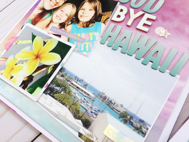
I am back today with my final post using the beautiful and super colorful MALIBU TN kit. If you haven’t checked the kit completely, then just click here -to be taken to the Clique Kits website-, and you could see the entire kit and add ons.
I have kept a journal/diary since i was a small kid. Through the years the format has changed, but I fell in love with TNs a few years back, and used them as my form of memory keeping/Project Life. So I thought, I will share with you how i have incorporated the Malibu TN kit to some of my daily TN entries.
We are babysitting my littles for the summer, so I had to snap a picture of the kids and my daughter as they enjoy some summer movie fun. I converted it to b/w so that it can easily fit into the spread without clashing with the colors in the papers. Next, I cut one of the papers from the Pink Paislee’s Summer Lights collection to about a 1/2in taller than the picture. I cut the paper so that it could easily fit into the 2 pages of the spread, and then added my picture at the end of the paper.
To balance the page, I cut some of the leftover pieces from the papers in the MALIBU kit (i am down to scraps of papers after all this projects!), and created banners. They all were attached to the top of the page, above the picture, in a cluster with a little piece of washi tape from my stash.
The typed journal lines balanced the spread, and a few embellishments made from the papers, stickers, and exclusive printables from this month’s Malibu kit complete this page. So simple and quick to put together.
Next, i used this striped paper from the Summer Lights collection (featured in this month’s Malibu TN kit) as it reminded me of a beach towel.
This time, I used the entire 6×6 paper sheet to cover the center of the 2 page TN spread. I cut the paper so that it fit on both pages, and glued a picture of the 2 girls to the top corner of the paper. I added a small piece of another paper to mat the picture, and make sure it pops from the busy background. a few fussy cut images from the CK Exclusive printables, and the papers along with the swim suit chipboard sticker is all that was needed to frame the picture.
I used my editing software to enlarge some of this month’s exclusive printables. In this particular page, I chose to add my sentiment inside the hexagon. I am loving the alphas from last month’s POOL PARTY kit. The color matched this month’s kit also.
Here is the final layout. I love how easy it came together, and all the color in the page -even in the journal lines… the neon pens included in the kit will steal your heart, too! I hope you all are ready to use the MALIBU KITS to document your summer adventures. There are a few available at the Clique Store, so make sure you can get your hands on one of them… You will love it!
Remember to leave me a comment if you have questions on how this came together, or just to say hi!
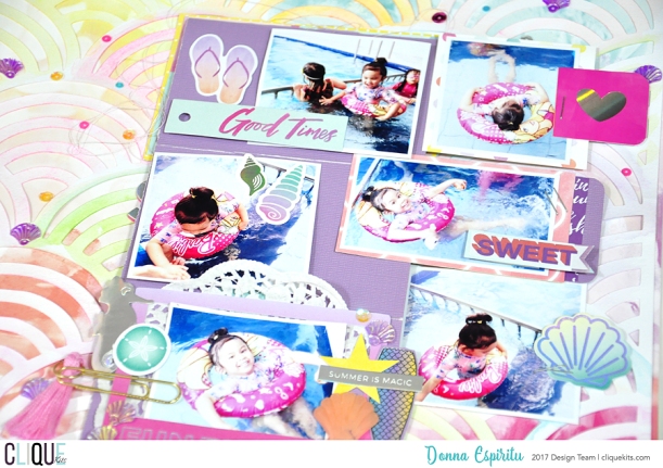
Hello scrappy peeps! I am so excited to have the ability to play with the Pink Paislee Summer Lights collection that is featured in the August 2017 kit. For today’s Yearbook spread, I documented a weekend with family and friends.
The holographic elements in this collection are my favorite. Once I figured out the photos it was easy to use some of the cut apart elements.
I used the stickers on the outside of the page protector from the 6×12 sheet. I like doing this to add some interest to my pocket pages. This months kit also comes with 5 dimensional sea shells that are so amazing but did not use them on this layout but I wanted to include them in the photos.
I did my journaling with a metallic silver pen to go with the holographic elements used in the layout.
I am 23 weeks pregnant here so I like watching my bump grow. My scrappy friend, Katty Miranda also came by to say hello that day. I am grateful to live in Florida so photos of palm trees are always needed to document summer.
Hope you have some inspiration for your next pocket page layout. Enjoy your scrapping.
Do you you ever have a story to tell that needs lots of space for journaling but you also have a bit of photos you want to use to highlight your story? What do you choose to do? This is where my brain says double page layout. I really like to give the photos room to breathe and leave lots of space to handwrite my story without worry that I will run out of room.
I know double pages aren’t all that popular anymore. We often have this concept in our mind of what they should look like or we are worried about filling all that space. If they aren’t your jam, that is fine too. I also want to remind you the cool thing about allowing your story and your photos come together to fit your style and rearrange how you think double pages can look like.
I used the Malibu Main August Kit to make my layout today. I also am cutting each side to 8 1/2 by 11. I am thinking this change in size will be a nice change in my album but also not feel so daunting as I feel the space.
I start with 2 pieces of white card stock, I like to start off with something empty and crisp. I edged one side with some bright purple chalk ink. I wanted to add a touch of color because I knew on the first side I was using the gorgeous sunset water paper.
I am not gonna lie, this paper is gorgeous and it saddened me to cut it down, but I knew it really would fit my spread better this way. One this first sheet I stitched some weird zig zag stitches. I carried it through to the other side by adding a strip of the sunset paper underneath it.
Adding the stitching all the way across will tie the layouts together to help tell a cohesive story.
The photos from each side are from a different place, I wanted it to be contrasting against each other as well. I layered some papers under the photos on the second side.
The first side I layered some of the embellishments from the kIt together to fit nicely near the start of the title.
The little squares from the speciality paper are my favorite. I used them all over my layout.
I really wanted my second page really simple so I could do my journaling on this page. I added a little bit of Shimmerz Creamez in pink and purple. The shimmer in the paint is so pretty but subtle that it really enhances the words that are written over top.
I mixed thickers from the August Main Kit with leftover Thickers from last month’s kit. They work so well together and the both really pick up on the colors in this kit. I wanted my title to run across both sides of the double page spread. I wanted to make sure though, that when the pages were separate they could stand on their own too.
I had fun adding the hologram phrase stickers through out the layout.
Here is a look at the full double page spread.
I really wanted my story and the few photos to do the focus. Little details like leaving room for the journaling and using my title to help tell my story really ties everything together.
Check out my process video and see me make this fun double page spread.
I hope that you are inspired to really use your photos and experiences to help tell your stories on your layouts. I also hope you share them online and use our hashtag #cliquekits so we can see your projects with your Clique Kits.
Hellooooo! Steph here again with another Travelers Notebook project for you!! Have you signed up for this kit yet?? Because it’s amazing!! CLICK HERE for more info on it. 😉
For this layout I balanced both pages with strips of pattern paper at the top and bottom. Keeping the colors light and airy, I chose a color scheme that worked well with my black and white photo and was available within my kit. I think this blue distressed woodgrain pattern paper may be my favorite. 🙂
I used the left side of my layout for journaling and kept it simple so it didn’t get too busy. Then my photograph and title went on the right page.
I loved this giant phrase die cut!! So cute!!
I hope you are all enjoying your summers!! Have you created with the Travelers Notebook kit yet? How do you like it??
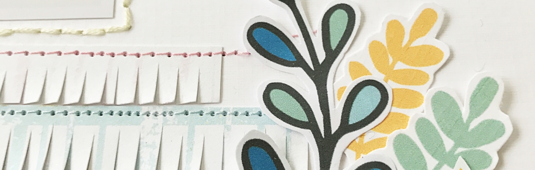
When I saw the very pretty blue paper from Pretty Little Studio: Ain’t Life Grand – 4 x 6 Paper collection I knew I would like to use for my next page and my pigeon’s picture is perfect for it.
I’ve edited the ’Reach for the sky’ title with the Silhouette Studio program and after I’ve cut it out of the white cardstock and I’ve backed it up the blue paper.
I’ve also added some word stickers from Pretty Little Studio: Ain’t Life Grand collection. I really loved to use these cute word stickers which it have completed my main title. When it was ready I’ve also splattered some green watercolour with my brush on the page.
The fussy cut flowers and the enamel dots were used to create a little clusters on the left and the right side of the photo.
I wanted to make my page excited a bit in that way I made the photo flipable and one more photo was added on the page.